

INSIGHTS HUB
Insights Hub emerged as a groundbreaking business intelligence tool, ingeniously leveraging a single PowerBI license to offer a unified platform for real-time data analysis. Designed for key decision-makers, managers, and analysts, it integrates PowerBI and other visualization tools to provide centralized access to reports and dashboards.
It enabled substantial cost savings of approximately 300K USD in licensing.
NECESSITY IS THE
MOTHER OF INVENTION

The problem at hand
Facing the challenge of a single professional PowerBI license limited to one device at a time, the company encountered significant hurdles. This restriction not only led to frustration during collaborative discussions and meetings but also resulted in a deluge of duplicate requests for reports. Such scenarios contributed to confusion within the BI department, which found itself juggling multiple requests for similar or identical reports due to the task ticketing system.

Frustrations
Confronted with the limitation that reports could not be simultaneously viewed by multiple stakeholders using the same account, the team faced operational inefficiencies. This necessitated stakeholders to either share their screens during calls or distribute screenshots to convey report details. Furthermore, the lack of visibility regarding report requests led to redundant submissions to the BI team, exacerbating the issue with an accumulation of task tickets. This scenario not only strained resources but also doubled the workload for the BI and Data Visualization teams on identical or similar reports.

Solution
Our objectives were clear. To address these challenges, we set forth the following goals -
- Streamline access to data insights, ensuring seamless collaboration across teams.
- Reduce redundancy and confusion in report requests, enhancing departmental efficiency.
- Establish a robust system that accommodates the dynamic needs of our data-driven environment.
- Enable concurrent access to reports for all stakeholders, fostering real-time collaboration and decision-making.
- Implement a system to track and manage report requests, preventing duplication and streamlining the request process.
- Optimize resource allocation within the BI and Data Visualization teams, reducing unnecessary workload and enhancing efficiency.

My Role
I took on the responsibility of conceptualizing the product idea, to researching the possibilities and designing the interface. Once the designs were ready, I also communicated with the devs and came up with a dev plan and offered to oversee the QA.

Tools Used
Since my primary tasks were to ideate, design, research and present, the tools I used were -
-Figma
-Miro
-PowerBI
-Google Data Studio
THE DESIGN PROCESS
Given a tight timeline of just 7 days for execution, the design process was agile and focused. Starting with low-fidelity wireframes, the design evolved through basic usability tests to a refined UI, adhering to the company's design system for a seamless and intuitive user experience.

Embarking on the Insights Hub project, the first step was to truly understand the challenges and needs of our users. I conducted interviews, not just as a formality, but with a genuine curiosity to uncover the nuances of their daily struggles with the single PowerBI license limitation. Shadowing them in their work environment, I observed the tangible impact of these challenges on their productivity and collaboration, gaining invaluable insights that would shape the foundation of this project.
I delved deep into the experiences of our users through a series of one-on-one interviews. Engaging with stakeholders, data scientists, and visualization engineers, I sought to uncover the nuances of their daily challenges, particularly those stemming from the restrictive single PowerBI license. Shadowing sessions provided a vivid picture of the workflow disruptions and collaboration barriers they faced, laying a solid foundation of empathy and understanding that would guide the subsequent stages of the design process. This immersive approach ensured that the development of Insights Hub was firmly rooted in the real needs and frustrations of its future users.
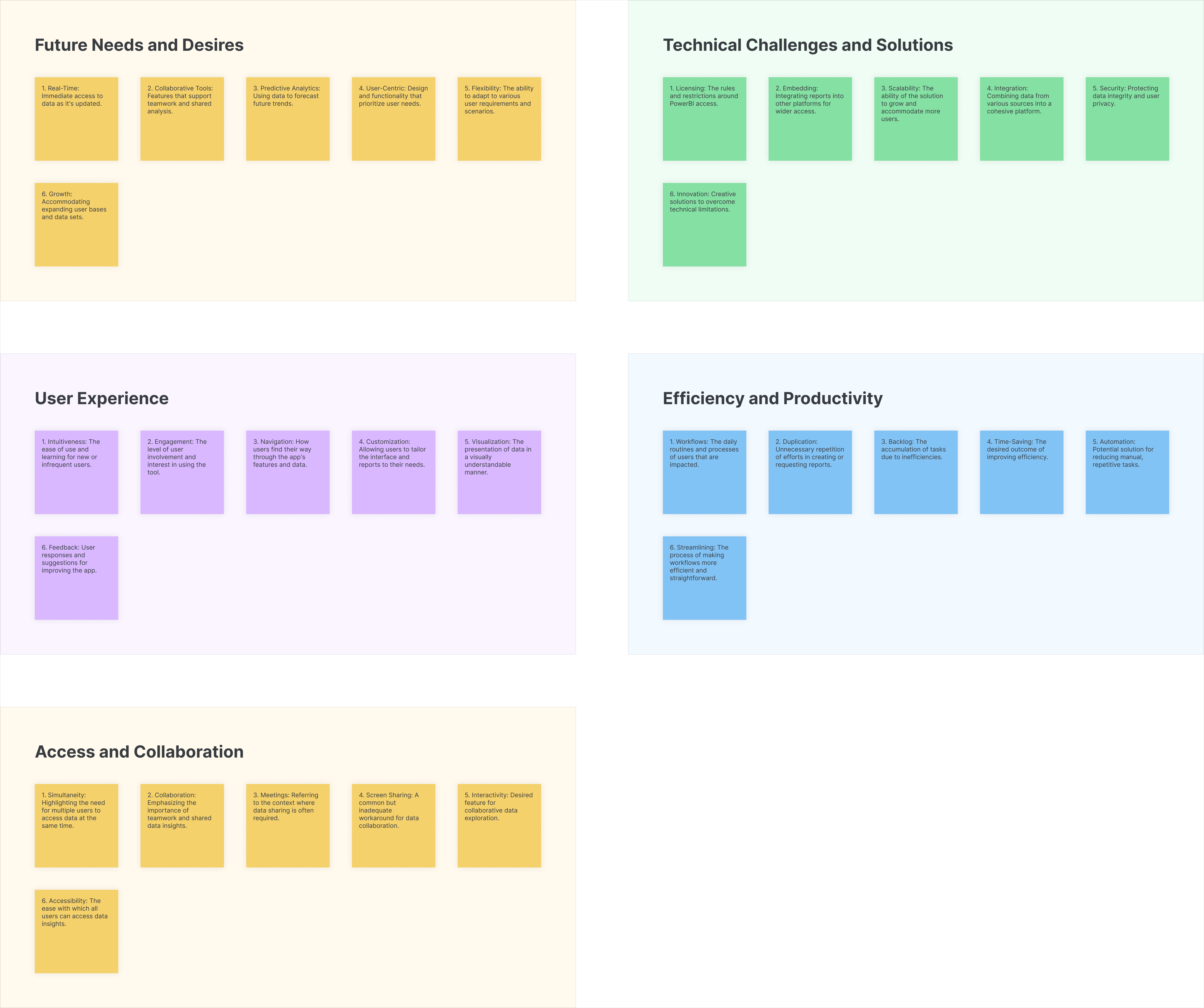
From the interviews I conducted, I then drew an affinity map.
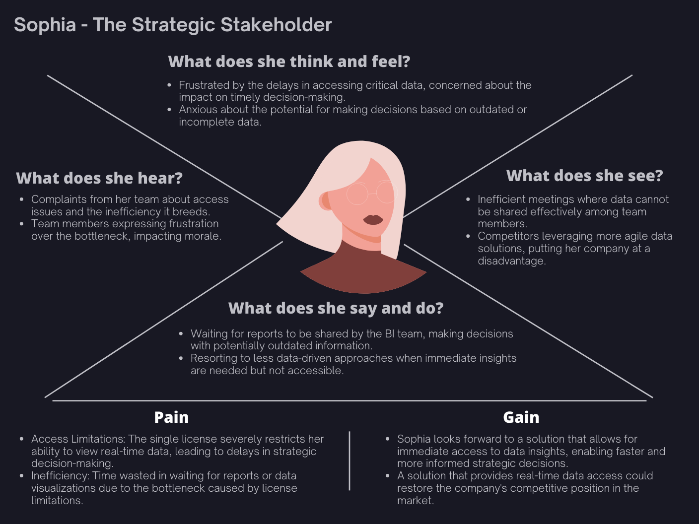
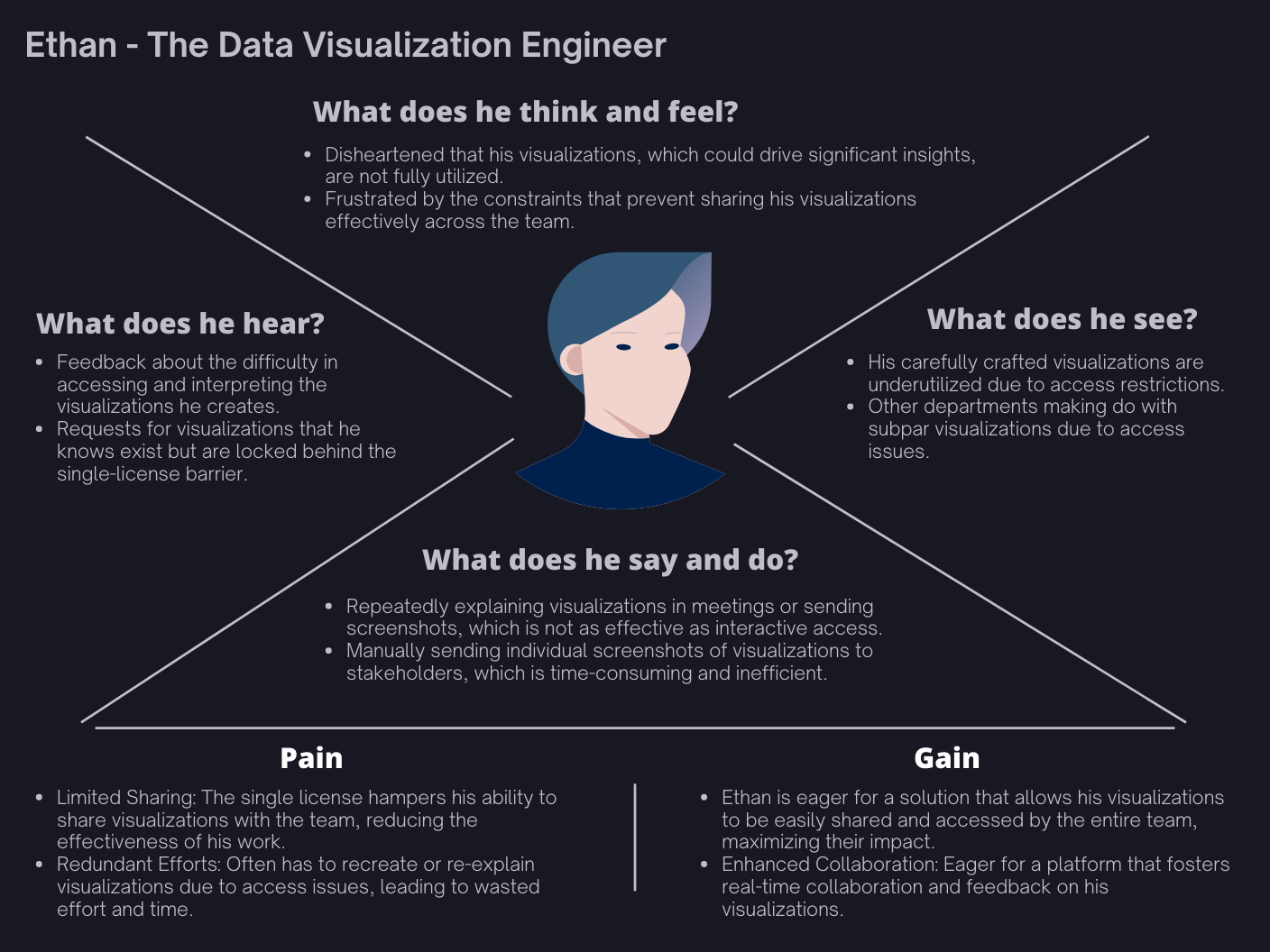
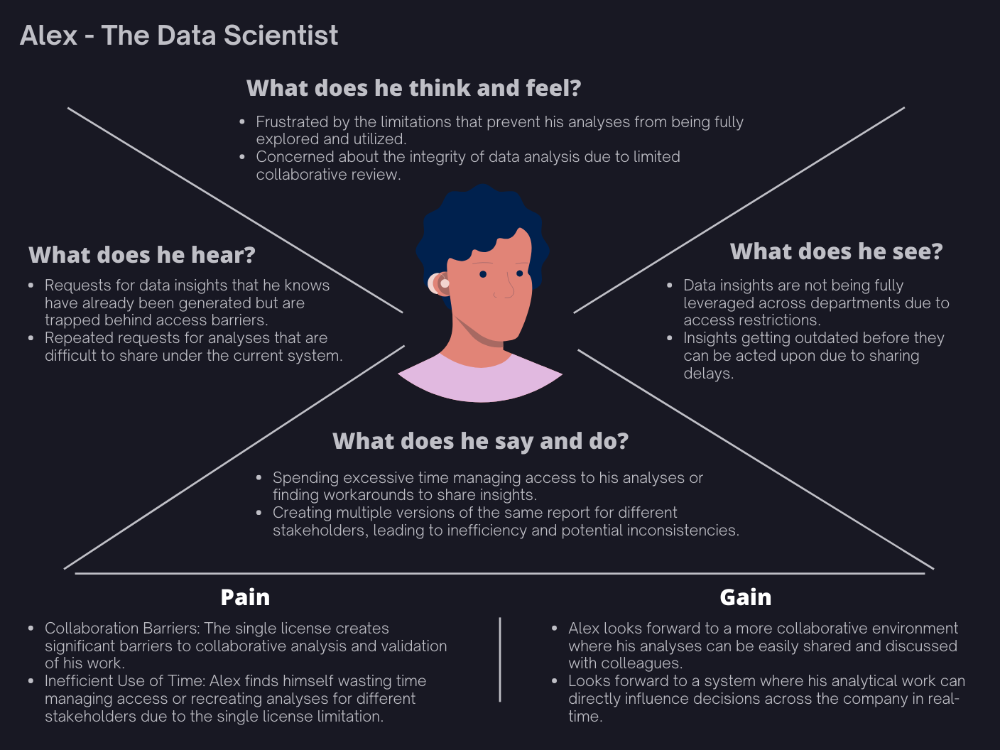
From the insights gained, I created three empathy maps for the user personas identified -
In a previous endeavor, I had successfully embedded a Tableau report into an application using Bubble.io, which sparked the idea of applying a similar approach to PowerBI reports within the Insights Hub project. Motivated by this past success, I delved into research to uncover whether PowerBI reports and dashboards could be similarly integrated. My exploration led me to discover comprehensive documentation that outlined the process for embedding PowerBI content. Armed with this knowledge, I embarked on a practical test: creating an HTML page designed to host the embedded PowerBI report. To ensure secure access, the page was configured to be accessible exclusively via the company's email IDs, leveraging Single Sign-On (SSO) for authentication. The critical test was to determine if this embedded report could be simultaneously loaded on multiple devices. This experiment was not just about technical feasibility; it was a pivotal step towards overcoming the limitations imposed by the single PowerBI license, aiming to enhance collaboration and data accessibility across the organization.
After successfully embedding the PowerBI report into an HTML page, we were eager to test it out and showcase our progress to the stakeholders. We organized a demo, inviting them to witness firsthand how the report could be accessed simultaneously on multiple devices. To our relief and their delight, the demonstration went off without a hitch. The stakeholders were genuinely impressed by the seamless functionality and the potential it unlocked for overcoming the single PowerBI license limitation. Their positive feedback was both affirming and motivating, giving us the green light to move forward with developing the application. It was a pivotal moment that underscored the value of innovative solutions and teamwork in addressing organizational challenges.
Post successful experimentation, I established the userflows for the rest of the tasks and I started wireframing the outline of the application, based on the context. Since we only had 7 days to execute the project and pass a demo, I chose a UI standard in-line with the available design guidelines at the time in the company's design system and kept the color palette very minimal and monochromatic, easy for the developer team to stick to without a complicated system to follow.
Here are some of the low fidelity wireframes -
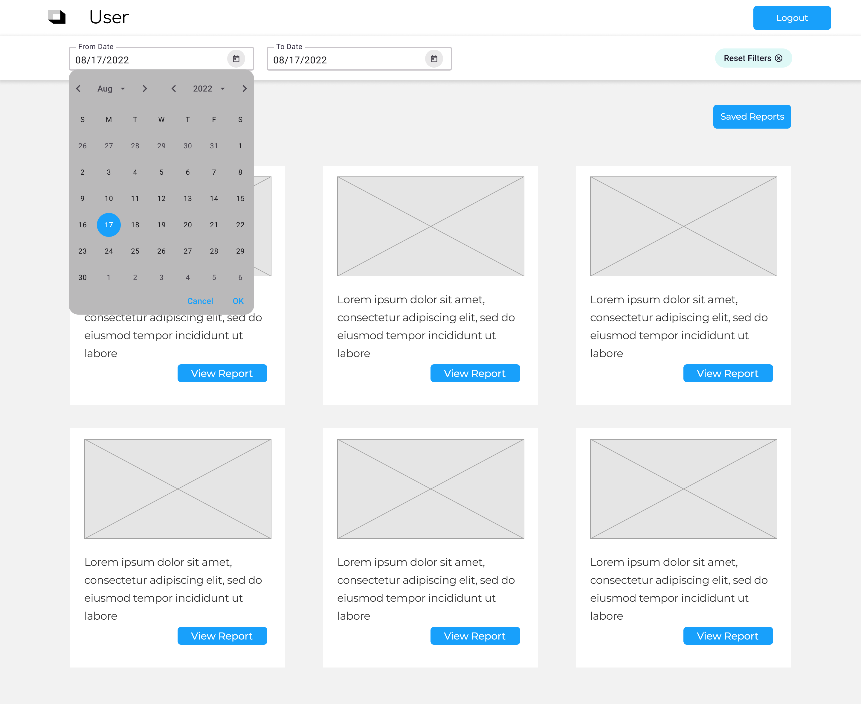
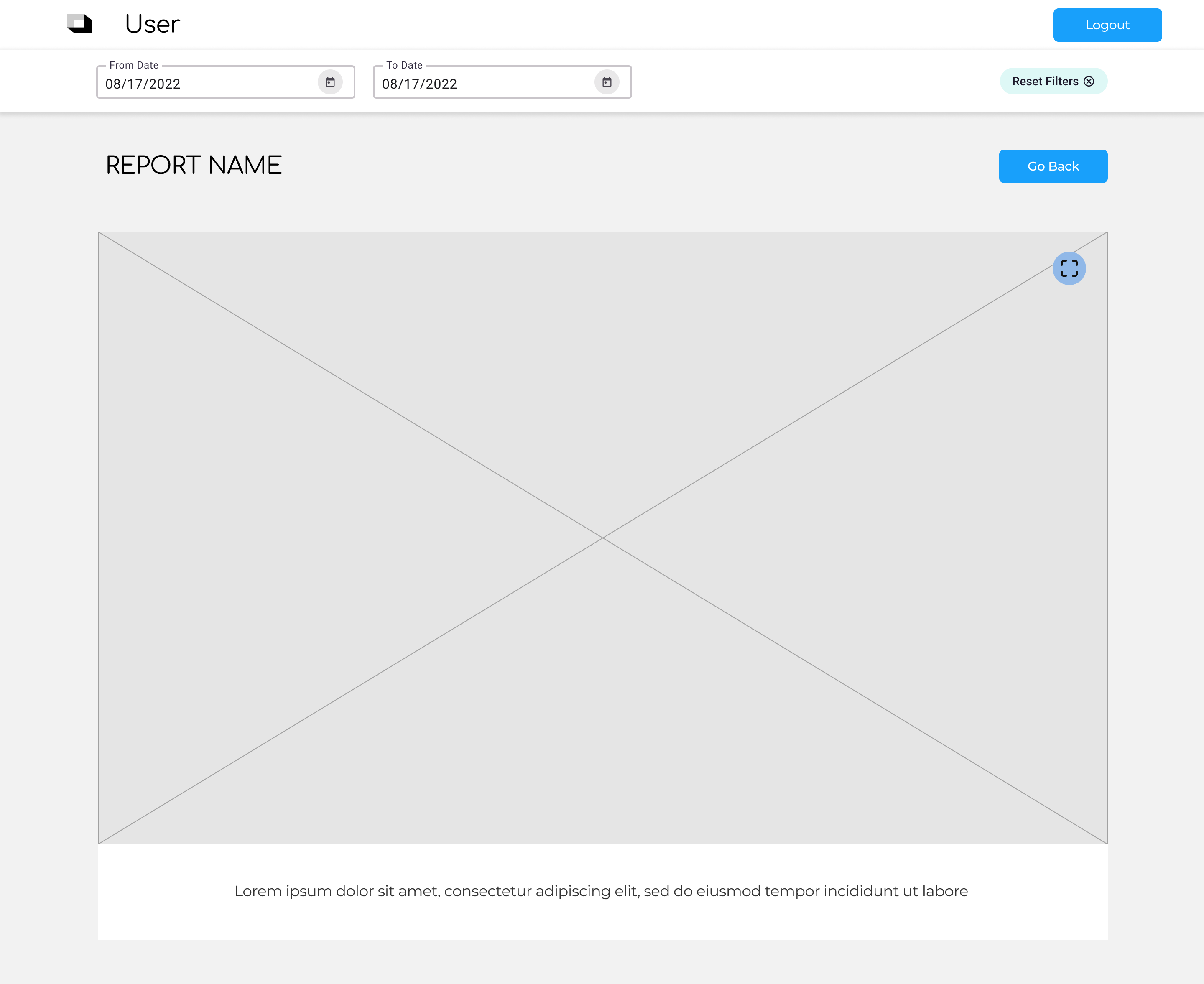
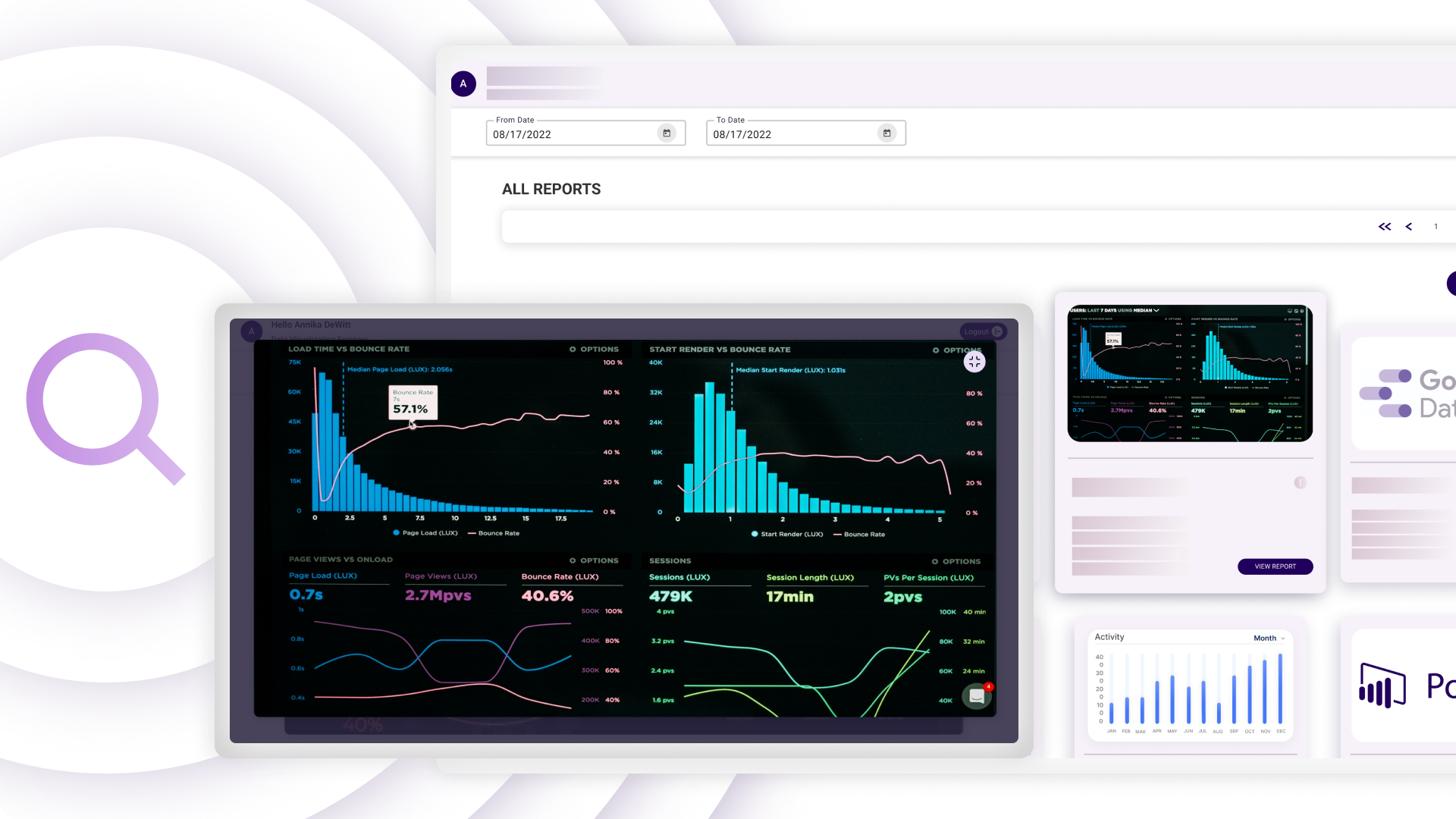
Once the wireframes ran passed our basic usability tests, I designed the UI -
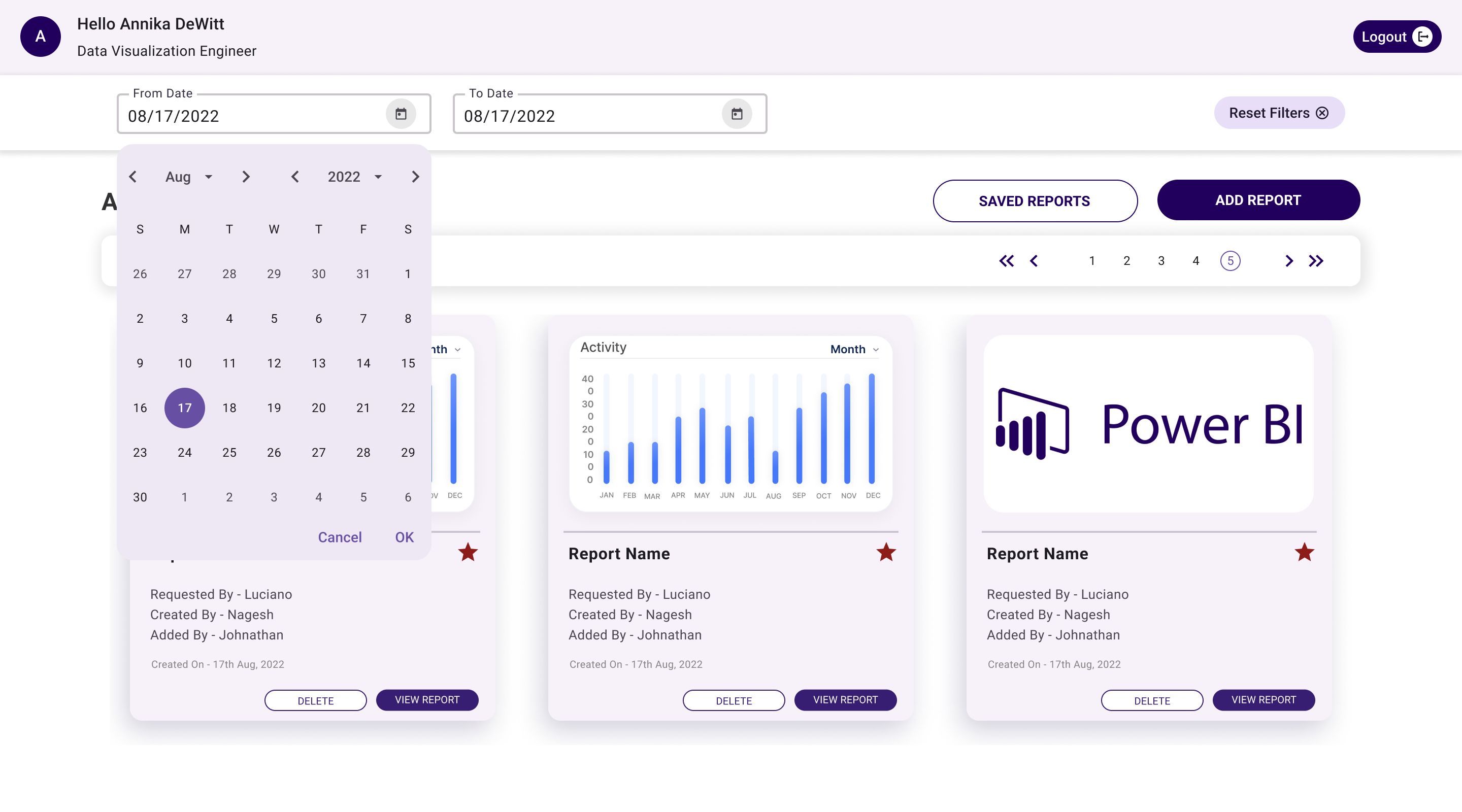
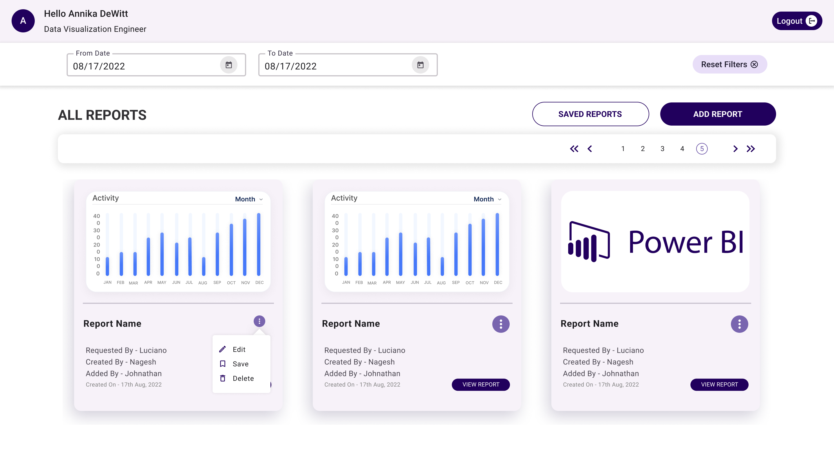
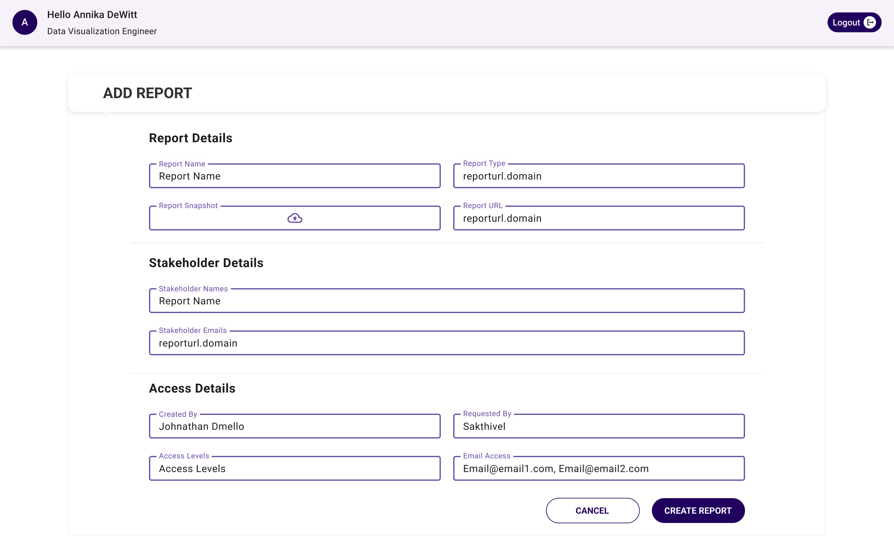
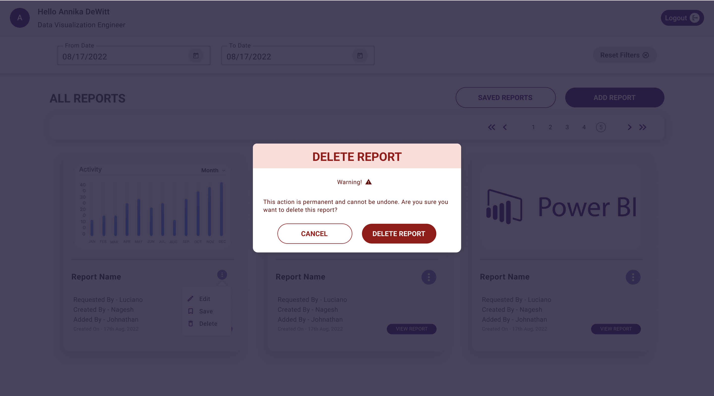
.png)
THE IMPACT
The launch of Insights Hub has significantly enhanced the data interaction and collaboration experience within the organization, marking a notable improvement just 3 months post-launch. While the platform has revolutionized how data insights are accessed and shared, fostering a more collaborative environment, there's an acknowledgment that some ingrained behaviors, particularly around data sharing and report requests, may need more time to evolve.
Key impact metrics observed include:
- Saved approximately $300,000 USD in licensing annually.
- The time taken to access and share reports has been reduced by 40%, streamlining decision-making processes.
- Overall team productivity has seen an uplift of 25% due to more efficient data access and reduced duplication of efforts.
- User engagement with data reports has increased by 30%, indicating a higher interaction and reliance on data insights for daily tasks.
- The incidence of redundant report requests has dropped by 15%, indicating a move towards more centralized and efficient data management practices.