
Prajnya

Senior product designer, Mumbai. I untangle healthcare, AI and complex B2B software until they feel simple and elegant.

Complicated software doesn’t have to feel complicated. I find the part that matters and make it obvious.

If I had to explain my job to a five-year-old: imagine a big box of tangled wires. Everyone’s scared to touch it. I’m the person who sits down with the box, finds the one wire that actually matters, and lays the rest out so anyone can plug things in without thinking. I do that with health records that live in ten places, money apps people are nervous to use, and AI that needs to say what it just did. Find the thing that matters. Make it obvious. Take away everything that was only there to make you nervous.

See selected works ↓

Some of my best work, lately

Four things I’m proud of: an AI layer inside a low-code builder, a design system any enterprise can make its own, a money-transfer app that people actually finished using, and a health record that belongs to the patient.

00 How do you ship a new agent without breaking the live one?Omnewave AgentStudio, agent builderProduct designAIInformation architectureVersioning ProblemTeams had to guess which lifecycle stage held the thing they wanted.What I didOne page per workflow, a shared Library, and versioning rules.OutcomeFour places to look instead of four stages. Versions with rules, and two ways to deploy. Read the story→ 01 How do builders know what the AI just changed?WaveMaker AI, low-code platformLeadershipAIDesign systemsPlatform UX ProblemBuilders couldn’t tell what the AI had done to their app, or why.What I didSuggestions as cards, a flat chat, honest agent status, one design system underneath.OutcomeA first working version in 1–2 hours, not 16–40. ~98% of AI changes applied. Finalist, Best AI Platform 2026. Read the story→ 02 How does one design system become every client’s brand?WaveMaker UI Kit and Style WorkspaceDesign system leadDesign systemsDesign tokensAI ProblemNo shared design system, so every client app was styled by hand. Then clients arrived with systems of their own.What I didBuilt the UI Kit on Material 3, then Style Workspace to theme it, and taught WaveMaker AI to build with it.OutcomeRebrands went from 4 sprints to 1. 100+ apps themed across 4 enterprise clients. 40–60 hours saved on a first build. Read the story→ 03 What if your health history followed you to every doctor?VITO, personal projectPersonal projectHealthcareConsent designPrototyping ProblemHealth history scattered across every doctor. Tests repeated, allergies missed.What I didFlipped ownership to the patient: consent per provider, one timeline, share a single visit.Outcome~100 conversations in waiting rooms. A working demo where two hospitals settle a clearance in one thread. Read the story→
04 Why were people abandoning money transfers halfway?TanggApp, remittance appLeadershipFintechResearchAccessibility ProblemPeople started money transfers and didn’t finish them. Onboarding leaked.What I didRedesigned send, KYC and onboarding, tested with real senders in two countries.OutcomeTransactions doubled. Activation up 37%. WCAG from 50% to 90%. Coming soon

I like the problems that have too many people in them.

Almost ten years of B2B product design across fintech, healthcare, logistics and developer tools. Right now I’m designing the AI side of a low-code platform at WaveMaker.

The work I’m best at has lots of stakeholders and messy data. Care split across doctors. Money crossing borders. AI that has to explain what it just did.

I prototype in code, HTML/CSS and React, because a team reacts differently to something that moves.

More about me →

HOW AGENTSTUDIO WORKS01AGENTSFrom the LibraryReusable parts02WORKFLOWBuildTest03VERSIONv1.2 · LiveRules per change04DEPLOYSandboxProductionThe workflow is the one place to build, test, version and deploy.
HOW AGENTSTUDIO WORKSAGENTSFrom the LibraryReusable partsWORKFLOWBuildTestVERSIONv1.2 · LiveRules per changeDEPLOYSandboxProductionThe workflow is the one place tobuild, test, version and deploy.

Case study · AI platform · Omnewave

AgentStudio

An agent builder for enterprise teams. Build an agent, put agents together into workflows, and ship a new version without breaking the one that’s live.
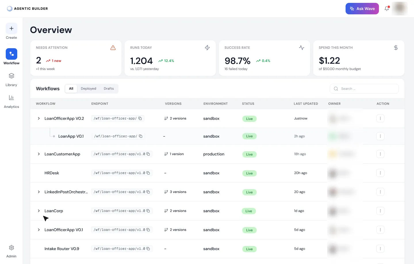
AgentStudio overview. Four figures across the top: needs attention, runs today, success rate and spend this month. Below, every workflow on one row with its endpoint, versions, environment and status.
TL;DR
  • 7objects in one model, from agent to run
  • 4places to look, instead of four lifecycle stages
  • 2ways to deploy, chosen at release
  • 3AI-made sitemaps I tested mine against

DesignedThe information architecture, the versioning model and 50+ screens, from overview to deploy.

ProblemThe first version split the product into Design, Configure and Operate. People had to guess which stage held the thing they wanted, and one workflow was managed from a list row, a menu and a side panel.

What I didMade the workflow the one place to build, test, version and deploy. Reusable parts moved to a Library. Versions got rules, so a change never surprises an app that’s already calling the agent.

Role: Product designer, from IA to UIContext: Omnewave, WaveMaker’s agent engineering brandTools: Figma, Claude, Lovable, Figma Make

6 min readAI platformInformation architectureVersioning

Context

What Omnewave is

Omnewave is WaveMaker’s agent engineering brand. It’s for enterprise teams that want AI agents running in production, with the same care as any other software. AgentStudio is where they build agents, put them together into workflows, and run them in sandbox and production.

Omnewave builds spec-first. The spec is the contract, and the code is derived from it. That shaped the product as much as the process: every workflow is also a readable spec, and my screens reached engineering the same way.

Research

Four builders, one missing half

I went through LangGraph, Crew AI, AutoGen and Muse screen by screen. Each is good at making something: LangGraph at the visual graph, Crew AI at starting from a prompt, AutoGen at teams of agents.

They’re built for the moment you make a flow. Enterprise teams live in the months after: which version is live, where it runs, who calls it, and what it costs. That half became the brief.

Problem 01

Four stages, and no obvious place to look

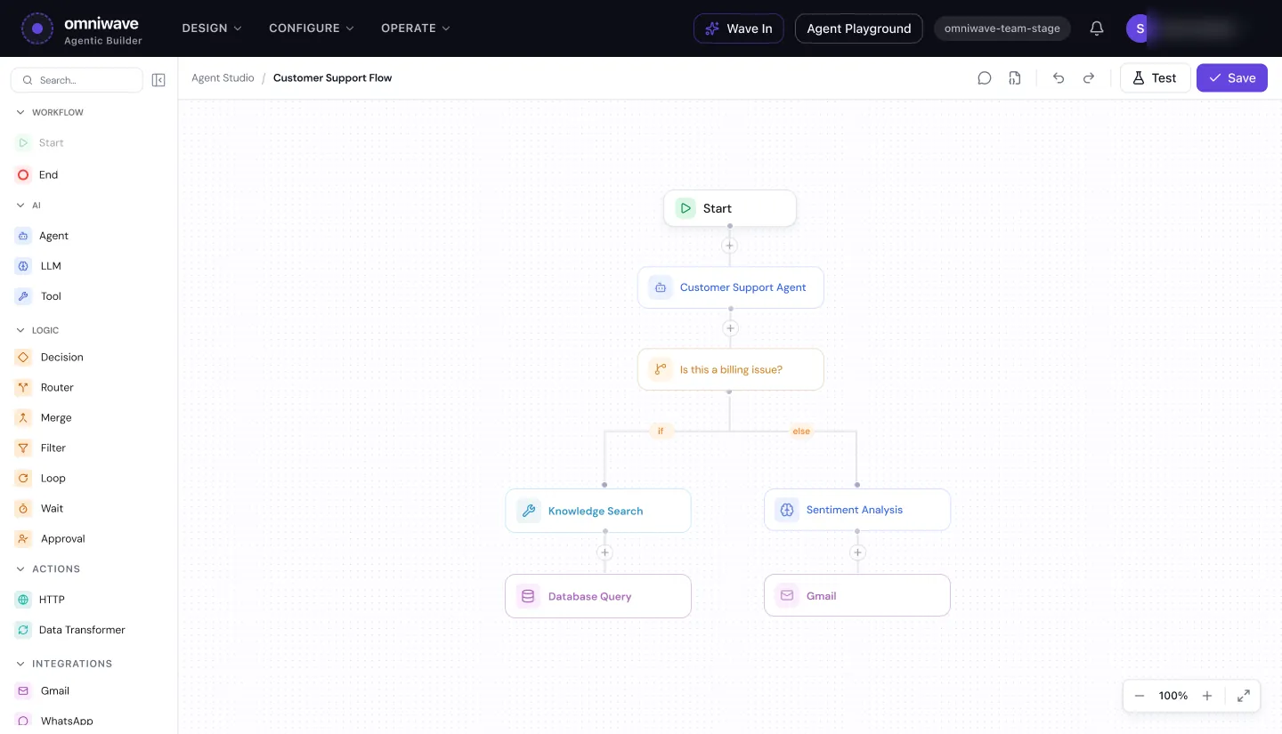
The first version’s top bar read Design, Configure and Operate. That’s how a team thinks about a lifecycle, not how people look for things. To change one workflow, you could start in any of the three.

How I solved it: I named the areas after things: Workflows, Library, Analytics and Settings. Everything about one workflow lives on one page. Agents, knowledge and tools are reusable parts, so they live in the Library. Members, models and keys sit in Settings.

The first version of the agent builder, with Design, Configure and Operate menus across a dark top bar, and a workflow on the canvas.
The first version. To find one workflow, you had to know which stage it was in.

How I got there: I wrote the sitemap first. Then I gave Claude, Lovable and Figma Make the same brief and asked each for its own sitemap. I put all four side by side. Two ideas held up and went in: one Library for every reusable part, and keeping runs, deployments, audit and analytics apart, because each answers a different question.

Problem 02

Agent or workflow? Draft or version?

Before any screen, the words had to mean one thing each. “Agent versus workflow” kept coming up, and “edit” could mean changing something that was live.

How I solved it: One object model, seven words. Each screen uses them the same way.

  1. AgentA reusable capability
  2. WorkflowAgents and steps, put together
  3. DraftWork you can still edit
  4. VersionA release that never changes
  5. EnvironmentWhere it runs: sandbox or production
  6. DeploymentOne version, running in one environment
  7. RunOne execution

Two rules came with it. Editing a deployed version creates a draft, so nothing live changes while you work. And a version never has more than one draft, so there’s never a question of which edit is the real one.

Problem 03

Open on what needs you

A workspace can run dozens of workflows. The first question each morning is what broke, not what exists.

How I solved it: The overview leads with what needs attention, then runs, success rate, and spend against the monthly budget. Below that, each workflow is one row, with its versions folded under it, its environment and its endpoint. A warning sits on the row that needs you.
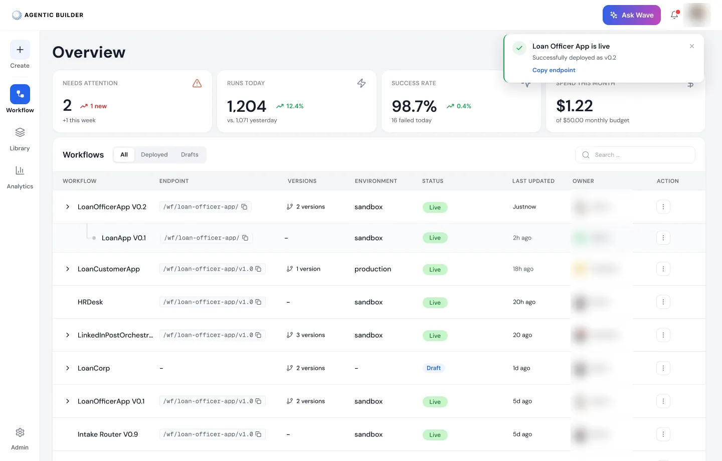
The overview after a deploy. A toast says Loan Officer App is live, deployed as v0.2, with a Copy endpoint link. The table shows versions folded under each workflow.
After a deploy, the toast confirms the version and hands over the endpoint. Owner names are blurred.

Problem 04

Cost shows up on the invoice, too late

Agents spend tokens at every step. In most builders, you learn what a workflow costs after it has run for a month.

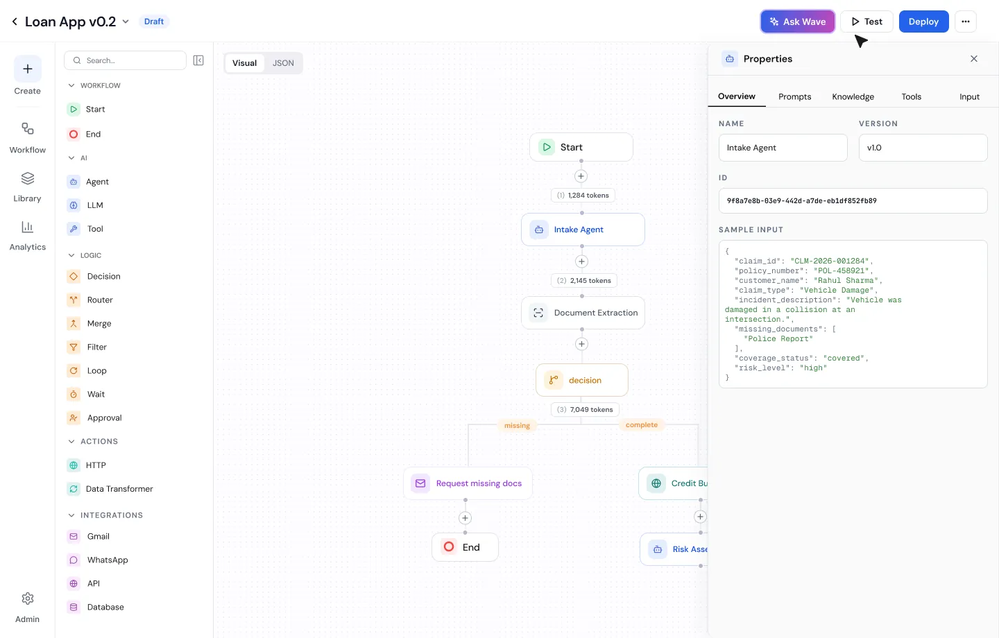
How I solved it: Every step on the canvas shows the tokens it used, so cost is visible while you build. Start from a blank canvas with Wave AI, or drag in nodes. The side panel only ever holds the selected node; everything operational moved to the page.
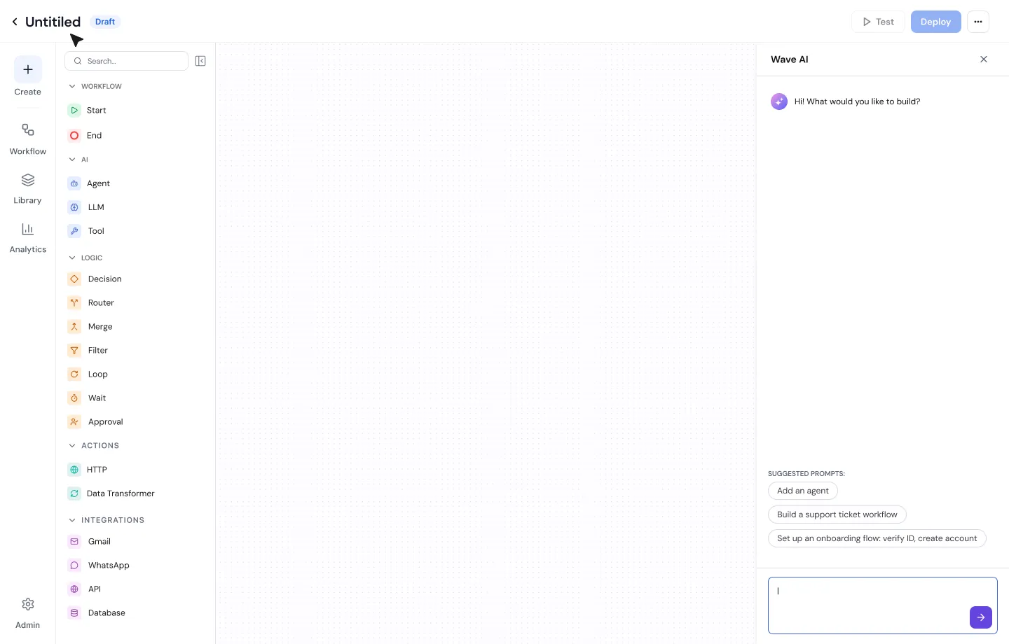
A blank workflow canvas with the node list on the left and Wave AI on the right asking what you would like to build, with suggested prompts.
Start from a prompt or from nodes.
A loan workflow on the canvas with a token count between each step, and the properties panel for the intake agent showing its version and sample input.
Tokens on every step. The panel shows only the selected node.

Problem 05

Shipping a change could break someone else’s app

Other apps call a deployed workflow by its endpoint. Change it in place, and every caller gets the change at once, whether they’re ready or not.

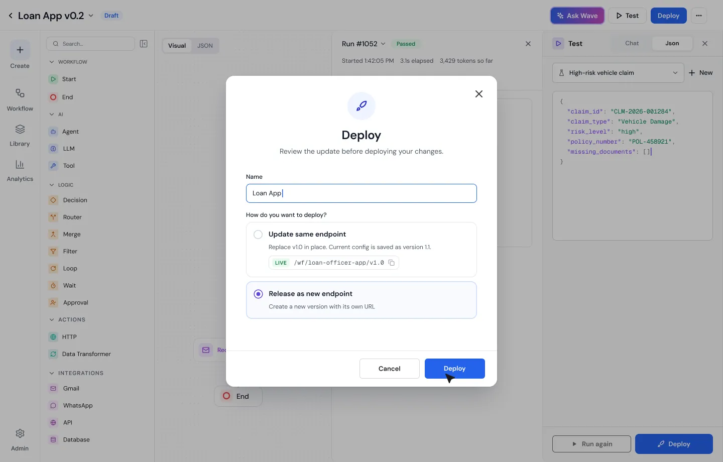
How I solved it: Test on the same canvas, with chat or JSON input, so there’s no separate test page. Then deploying asks one question: update the same endpoint, or release a new one? An update replaces the live version and keeps the old config as a version. A new endpoint leaves the old version and its callers untouched.
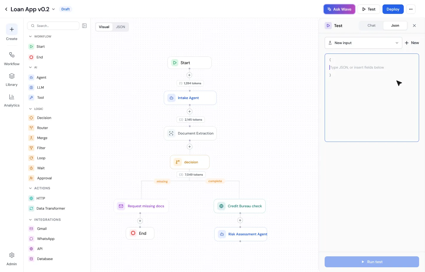
The test panel open beside the canvas with a JSON input box and a Run test button.
Test in place, with chat or JSON.
The Deploy dialog with two choices: update the same endpoint, which replaces v1.0 and saves the current config as v1.1, or release as a new endpoint with its own URL.
One question at deploy: same endpoint, or a new one.

Problem 06

“What did I change?”

A draft can sit for days. By the time it ships, nobody remembers everything that changed in it.

How I solved it: Compare the draft with the live version before shipping. Changed steps are marked Added or Modified on the canvas, and Wave AI lists every change in plain words, with the old value and the new one.
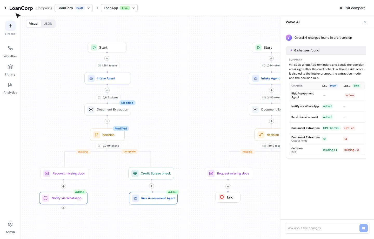
Draft and live versions side by side. Changed nodes are tagged Added and Modified, and Wave AI lists six changes in a table: a new WhatsApp step, a new email, a model change and a rule change.
Draft against live: six changes, each with its old and new value.

Library

Templates that say what they need

A template you can’t finish setting up is worse than none. So every template shows what it needs before you use it: the connections, the inputs and outputs, and which connection is still missing.
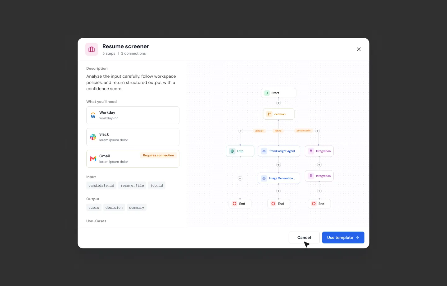
The Resume screener template preview. It lists what you will need: a connected HR system, a connected chat app, and an email account marked Requires connection. Inputs and outputs are listed, with the workflow drawn on the right.
The missing connection shows up before you start, not halfway through.

The spec underneath

Every workflow is also a spec

Flip any workflow from Visual to JSON. Select a step on the canvas and the JSON highlights it. Reviewers read exactly what the agent runs.
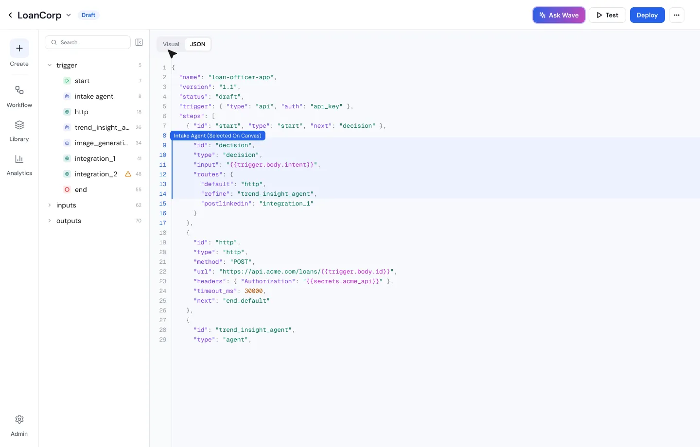
The JSON view of a workflow, with a tree of steps on the left and the decision step highlighted in the JSON on the right.
The same workflow as JSON, with the selected step highlighted.

The product is built the same way. Omnewave uses spec-driven development with Spec Kit, and my screens reach the build through figma-starter, the open-source Spec Kit extension whose Figma conventions I set. Give it one Figma section, and it writes the screens, the flow map, the build order and one spec per screen. A second command binds each screen to its APIs. The tokens those specs use come from the design system I lead, in the Design system case study.

Launch

Vantage: telling the story

Vantage is Omnewave’s AI testing tool. It explores a web app like a real user and writes the tests. I designed its product UI, and I wrote the story and the script for its launch film. I also helped shape the concept, the workflow and the storyboard, and showed the team how to make the film with AI, using Claude, and ElevenLabs for the voice.

The film opens on a countdown: an hour until the release goes out, and nobody is sure checkout still works. It walks through Vantage in six steps, then ends on the same countdown a week later. You won’t be hoping.
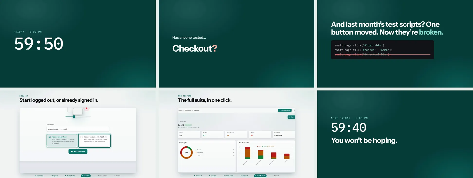
The first 27 seconds. The full film runs 3:08 and is live on Omnewave’s Vantage page.
Six frames from the Vantage film: a countdown at 59:50 on Friday at 6 PM; Has anyone tested checkout?; last month’s test scripts broken by one moved button; recording a flow; the full suite in one click; and next Friday’s countdown with the line You won’t be hoping.
The arc: the countdown, the doubt, the fix, and the same countdown a week later.

Next

What’s next in the designs

From a prompt to a change you can check: plan, build, steer, preview, apply. A recreation with sample data, 24 seconds.

Case study · AI on a low-code platform

WaveMaker AI

The AI layer inside a low-code builder. Workflows, a suggestions system, an AI chat, and the design system that holds all of it together.

TL;DR
The A.I. Awards 2026 finalist badgeFinalist, Best AI PlatformThe A.I. Awards 2026 · shortlisted alongside EY, PagerDuty and BMC Software
  • 1–2 hrsto a first working version, not 16–40 by hand
  • ~98%of AI change sets applied
  • ~99%of agent runs finished cleanly
  • −86%back-and-forth with developers

~98% and ~99%: 18 developers over two weeks. −86%: my count of threads and meetings, before and after prototyping in code.

Key changeBuilders see what the AI changed, and preview it, before it lands.

ProblemBuilders couldn’t tell what the AI had done to their app, or why. Suggestions got ignored, chats got lost, and every AI surface looked different.

What I didDesigned the whole AI layer: suggestions as cards, a flat chat, agent status you can trust, and one design system under all of it.

Role: Senior Product Designer & ResearcherTimeframe: May 2024 – presentTeam: PMs and engineering leads across three time zones

5–7 min readAIDesign systemsPlatform UX

Context

The setup

WaveMaker is a low-code platform. Developers use it to build real apps fast, and they trust it because it doesn’t surprise them. Then AI arrived, and the question was how to put it inside a tool like that without breaking the trust. I lead design from discovery to shipped, and partner with product and engineering on the quarterly roadmap. So this wasn’t “make the AI screen pretty.” It was “decide what the AI is, in this product.”

AI suggestions panel with three cards showing high, medium and low priority badges, step counts and filters
Suggestions as cards: a priority, a size and three filters.
AI chat panel with search, a filter for All, Pages and Agents, and chats grouped by status with page and area tags
Chat navigation: three levels became one list and a filter.

Recognition

On the shortlist

WaveMaker’s AI-powered app generation platform, the product this case study is about, was named a finalist for Best AI Platform at The A.I. Awards 2026.

The A.I. Awards 2026, Best AI Platform finalists: ADNOC Offshore, AVOXI, BMC Software, Epiq, EY, Geographic Solutions, MYOB Acumatica, PagerDuty, ScienceLogic, TransPerfect, Unframe, Vida Global, WaveMaker and Welldoc
The full finalist list. See it on The Cloud Awards.

Hear more stories!

Please use the password I provided to view the project details. If you don’t have it, feel free to contact me and I’d be happy to walk you through it privately.

HOW WAVEMAKER AI WORKS01PROMPTDescribe it02PLANLayout first03BUILDWidgets04STEERAdd context05PREVIEWDiffs outlined06APPLYOr undoFrom a prompt to a change you can check before it lands.
HOW WAVEMAKER AI WORKSPROMPTDescribe itPLANLayout firstBUILDWidgetsSTEERAdd contextPREVIEWDiffs outlinedAPPLYOr undoFrom a prompt to a change youcan check before it lands.

Full case study · Under NDA

WaveMaker AI

One token change, and the whole product follows: tokens land in four buckets, then colour, size, text and style each re-theme every screen and mode. Style Workspace with a sample app, 30 seconds.

Case study · Design systems on a low-code platform

Design system and Style Workspace

I built WaveMaker’s first design system and the tool that themes it, so one library can become any enterprise’s brand, in Figma, in code, and in what WaveMaker AI generates.

Style Workspace 2.0 in dark mode, with the colorPrimaryHover popover showing its chain to Blue/7 and #3C89E8, its light-mode value and the 28 tokens that reference it
TL;DR
  • 4 → 1sprints to rebrand an app
  • 100+apps themed across 4 enterprise clients
  • 40–60hours of frontend time saved on a first build
  • 1–2 hrsper later update, down from about 40

Key changeOne library, re-themed from a single hue, for people and for the AI.

ProblemWaveMaker had no shared design system, so every client app was styled by hand. Then clients tested V1 with their own systems, and their tokens didn’t fit our fixed set.

What I didBuilt the UI Kit on Material 3 (45+ components), then Style Workspace to theme it: four fixed buckets, three token tiers, the full chain on hover, and rules WaveMaker AI follows to build on-brand.

Role: Design system lead and PMTimeframe: May 2024 – October 2026Team: Eight people across design, engineering and AI

9–11 min readDesign systemsDesign tokensAI

Context

The setup

WaveMaker is a low-code platform. Enterprises use it to build their own internal and customer apps, often with our in-house product services team doing the build. Every one of those apps needs to look like the client, not like us.

WaveMaker had no shared design system. I built one on Material 3, then Style Workspace, the tool that themes it. When clients tested V1 with their own design systems, their tokens didn’t fit our fixed set, so 2.0 was rebuilt to hold each team’s own tokens.

Hear more stories!

Please use the password I provided to view the project details. If you don’t have it, feel free to contact me and I’d be happy to walk you through it privately.

HOW STYLE WORKSPACE WORKS01YOUR SYSTEMImportedNames kept02MAPPEDBy rule firstThen by model03FOUR BUCKETSColor · SizeText · Style04EVERYWHEREFigmaCodeWaveMaker AIWaveMaker owns the buckets. Teams keep their tokens.
HOW STYLE WORKSPACE WORKSYOUR SYSTEMImportedNames keptMAPPEDBy rule firstThen by modelFOUR BUCKETSColor · SizeText · StyleEVERYWHEREFigmaCodeWaveMaker AIWaveMaker owns the buckets.Teams keep their tokens.

Full case study · Under NDA

Design system and Style Workspace

THE NEW SEND FLOW01AMOUNTFee and rateUp front02RECIPIENTWho gets it03PAYMENTNo surprises04SENTOne-handedEnd to endThe real cost moved to the first step.
THE NEW SEND FLOWAMOUNTFee and rateUp frontRECIPIENTWho gets itPAYMENTNo surprisesSENTOne-handedEnd to endThe real cost moved to the first step.

Case study · Fintech, remittance

TanggApp

A global money-transfer app, redesigned end to end. Transactions doubled. Activation went up 37%.

TL;DR
  • 2×transactions
  • +37%activation
  • 90%WCAG compliance, up from 50%
  • −95%implementation errors

Key changeFees moved to the front of the send flow.

ProblemPeople started money transfers and didn’t finish them. Onboarding leaked. Accessibility sat at 50% WCAG, a legal problem for an app that moves money.

What I didRedesigned the send flow, KYC and onboarding, testing with real senders in two countries, and wired design to code with tokens.

Role: Senior Product Designer & Researcher, contractTimeframe: Sept 2024 – Mar 2025Team: Product, marketing, engineering

4–6 min readFintechResearchAccessibility

Context

The setup

Tangg is a remittance platform. People use it to send money home, and the amounts are small, frequent, and matter a lot. A failed transfer isn’t a bug. It’s rent. I directed the end-to-end UX on a six-month contract.

Flow · sending money

Fees moved to the front of the send flow

Before
  1. 01AmountHow much to send.
  2. 02RecipientWho gets it.
  3. 03PaymentHow to pay.
  4. 04Fee and rateThe real cost shows up last.
After
  1. 01Amount, fee and rateThe real cost, up front.
  2. 02RecipientWho gets it.
  3. 03PaymentNo surprises left.
  4. 04SentWorks one-handed, end to end.

Tested remotely with real senders in two countries, on their own phones. Transactions doubled after launch.

Flow · design to code

One source of truth, two tools reading it

Flow
  1. 01Figma tokensColors, type and spacing defined once.
  2. 02Shared GitHub repoThe single source of truth.
  3. 03Design reads itFigma stays in sync.
  4. 04Build reads itNo one retypes a hex code.

Implementation errors dropped 95%.

Hear more stories!

Please use the password I provided to view the project details. If you don’t have it, feel free to contact me and I’d be happy to walk you through it privately.

THE NEW SEND FLOW01AMOUNTFee and rateUp front02RECIPIENTWho gets it03PAYMENTNo surprises04SENTOne-handedEnd to endThe real cost moved to the first step.
THE NEW SEND FLOWAMOUNTFee and rateUp frontRECIPIENTWho gets itPAYMENTNo surprisesSENTOne-handedEnd to endThe real cost moved to the first step.

Full case study · Under NDA

TanggApp

HOW VITO WORKS01PATIENTOwns the record02CONSENTPer provider03ONE TIMELINEAcross hospitals04DOCTORSDirect lineClearance threadA record the patient owns, shared with each doctor by consent.
HOW VITO WORKSPATIENTOwns the recordCONSENTPer providerONE TIMELINEAcross hospitalsDOCTORSDirect lineClearance threadA record the patient owns, sharedwith each doctor by consent.

Case study · Healthcare · Personal project

VITO

A health record that belongs to the patient, not the hospital. So nothing gets lost between doctors.

The rebuilt VITO app. On a laptop, Dr. Jain sees Meera’s record with a banner saying Meera shared it, pre-op checks and signals. On a phone, Meera’s home shows Dr. Jain’s request to see her records.
TL;DR
  • ~100research conversations
  • ~60fellow patients
  • ~17doctors
  • ~25peers

BuiltA working demo of the patient and doctor apps, with a live clearance thread between two hospitals.

ProblemYour health history lives in pieces across every doctor you’ve seen. Tests get repeated, allergies get missed, and the patient carries a plastic folder.

What I didFlipped ownership to the patient: consent per provider, one timeline across hospitals, and a direct line between doctors so the patient stops being the messenger.

Role: Solo product designerContext: Personal projectTools: Figma, React prototypes built with Claude

7–8 min readHealthcareConsent designPrototyping

Try the live demo →Switch between Meera, Dr. Jain and Dr. Bhave to see one record from each side. Sample data only.

Context

The setup

VITO started during a healthcare UX certification. I kept going after it ended, because the gap is real. I kept running into it, personally and professionally, and it’s a systems problem pretending to be an app.

The people I designed for have serious or long-term conditions. Their care spans several specialists, often at different hospitals, and none of those systems talk to each other.

Research

About a hundred conversations, mostly in waiting rooms

I didn’t design this from a desk. I talked to fellow patients while we waited for appointments, to doctors, and to peers who had cared for someone through complex treatment. Then I read patient communities, survivor and caregiver blogs, and research on care coordination to see if the pattern held. It did.

~60fellow patients
~17doctors
~25peers and caregivers

What kept coming up

What exists today

Aggregation got solved. Coordination didn’t.

The closest thing already ships on every iPhone. Apple Health Records pulls records from participating hospitals into one place, and it’s easier to use than earlier attempts. It still stops at collecting. India’s ABHA app and ABDM-linked lockers like Eka Care and Driefcase give patients a consent-based record, and CommonHealth does the same on Android. They collect and share records, but coordination between doctors is still left to the patient.

2%of people with several patient portals used a third-party app to combine their records PubMed Central
0ways for two doctors to talk to each other inside it

Having records in one place isn’t the gap. The doctors still can’t see each other. That became the brief.

For patients managing complex conditions across several specialists and hospitals, VITO is one record that follows the patient, open to every care team they choose.

Problem 01

The record belongs to the hospital

Every portal is built for the institution, with a patient login bolted on. The person with the most at stake has the least control.

How I solved it: I flipped ownership. The patient holds the record and connects every source: hospital portals, devices over Bluetooth, and scans of paper reports. It works on a basic smartphone, because many patients don’t have the latest one.

Meera’s Sources page listing Tata Memorial, Kokilaben Hospital, a glucose monitor, a watch and her uploaded documents, each connected.
Meera connects every source herself: hospital portals, devices and scanned reports.

Problem 02

A folder, not a story

Clinic by clinic, the history is a stack of unrelated PDFs. Finding “the last time this was checked” is a search, not a glance.

How I solved it: One timeline. Every visit, test and prescription on a single line across hospitals, filterable by type. Next to it, a daily view for vitals, medicines and symptoms. Anything Meera logs herself is labelled patient-reported, so a doctor always knows the source.

Meera’s timeline with records from both hospitals, filter chips and patient-reported entries labelled.
One timeline across hospitals, filterable by type.
Track page with vitals charts from devices and a 1 to 5 symptom check-in.
Vitals from devices, symptoms from Meera, each labelled by source.

Problem 03

All-or-nothing sharing

A second opinion meant handing over your entire history, or nothing.

How I solved it: The patient chooses the level for each doctor: full access, a summary of conditions, medicines and allergies, or specific documents. Access can end on a date, and can be removed at any time. Every view goes into an access log the patient can read.

Sharing page listing which doctors have access, exactly which records each can see, until when, and an access log.
Meera sees who has access to what, until when, and every view.

Problem 04

Doctors can’t talk to each other

This is the part existing tools skip, and where I spent the most time. I built the design around one real scenario: a transplant patient, Meera, who now needs cancer surgery at a different hospital.

Clinicians only thread between Dr. Jain and Dr. Bhave showing the clearance request, conditions and the flagged platelet mismatch, with a note that Meera can’t see it.
Clinicians only: the platelet mismatch is flagged and settled between doctors. Meera can’t see this thread.

Dr. Jain, her gynae-oncologist, needs clearance from Dr. Bhave, her transplant doctor. Dr. Bhave clears her on condition that platelets are above 100K. Dr. Jain’s anaesthesia plan assumed 75K. In VITO, Dr. Jain spots the mismatch and asks in the thread. Dr. Bhave confirms one number, looking at the same labs.

Flow · surgical clearance

Two doctors, two hospitals, one number agreed

Without
  1. 01Clearance askedThrough the patient.
  2. 02Numbers disagreeClearance needs platelets above 100K. The anaesthesia plan assumed 75K.
  3. 03Patient relaysCalls back and forth while surgery waits.
With VITO
  1. 01Dr. Jain asksRequests clearance in the clinicians-only thread.
  2. 02Dr. Bhave clearsOn condition that platelets are above 100K.
  3. 03Mismatch spottedDr. Jain sees the 75K assumption and asks in the thread.
  4. 04One number agreedBoth look at the same labs, in real time.
  5. 05Meera sees status“Your doctors are coordinating.” No clinical back-and-forth.Care teamClinicians only

What Meera sees: “Your doctors are coordinating.” She knows where things stand, without the clinical back-and-forth.

Two conversations, two audiences: Care team holds Meera and every doctor treating her, so each doctor sees what the others told her and every question she asked. Clinicians only is where doctors align first, so she gets one clear answer instead of the debate and the cognitive load that comes with it.

Care team thread where Meera asks a question, Dr. Jain answers, and Dr. Bhave tells her she is cleared for surgery, beside a clearance progress list.
Care team: Meera’s question, both doctors’ answers, and her clearance progress in plain language.

Steps for her, checks for them: pre-op checks belong to the doctors who order them. Meera only sees her own steps, like booking an appointment or uploading a report. The doctor ticks the check off once they’ve seen the result.

Pre-op checks card shared by both hospitals, each check owned by a doctor and showing whether it is waiting on Meera, booked or ready to review.
Shared pre-op checks. Each belongs to a doctor; Meera’s part is to book or upload.

Problem 05

Doctors couldn’t ask for just what they need

Doctors raised this in testing: how do I ask a current patient for the past records that matter to today’s treatment? Asking for everything is easy, but it isn’t fair to the patient.

How I solved it: a records request designed from all three sides.

  • The doctor asking picks a purpose, like surgical planning. VITO suggests the records that purpose needs, and each one carries a reason in plain words.
  • The patient deciding sees each record, why it’s needed and a one-line preview of what’s in it. Only the ones needed for care come pre-ticked, so the easy answer is the minimum. Counselling notes and genetic results are never shared unless she chooses to.
  • The doctor who already holds her data sees what’s been asked. Meera can ask him before she decides, in the care team thread.
Request card on Meera’s Sharing page: Dr. Jain wants 6 records for surgical planning, each with a reason and a preview. Four needed records are ticked, two nice-to-have ones are not.
What Meera sees: each record, why it’s needed and what’s in it. Only what’s needed comes pre-ticked.
Dr. Jain’s request form with a purpose, suggested records and how long access lasts.
Dr. Jain picks a purpose; VITO suggests the records it needs.
Records Meera shared with you card listing shared records with previews and locked ones marked not shared.
What Dr. Jain gets: only what Meera approved.
Dr. Bhave’s card showing what Dr. Jain can see and what she has asked for.
Dr. Bhave sees what Dr. Jain has and what she asked for.

When treatment ends: live access closes. The doctor keeps a de-identified case for reference and teaching: no name, contact details, ID numbers or exact dates, with the clinical course shown as days from the first consult. The hospital’s own medical record stays under its own rules.

De-identified case VT-0412: female, 30 to 39, clinical course in days from first consult, records kept, and a list of identifiers removed.
After treatment: a de-identified case, with dates turned into days and identifiers removed.

Key decisions

The calls that shaped everything else

Patient owns, doctors are invited

Ownership sounds like policy. It’s a design decision, and every screen after it changed because of it.

Status for patients, detail for doctors

The patient sees progress in plain language. Clinical messages stay between care teams.

Show where every number came from

Hospital labs, device readings and patient logs share one timeline, each with its source. AI-surfaced signals cite the records behind them.

Prototype in React, not just Figma

Medical data is dense. Real scrolling, grouping and state changes showed problems a static frame would hide.

Feedback

“How is this different from what’s out there?”

That was the first question in review, and the right one. My answer came straight from the research: VITO coordinates instead of only collecting, it works on any smartphone, and it follows the patient instead of one hospital.

“What you’re doing isn’t necessarily unique, but I like how you’re approaching it.”Reviewer feedback

Usability testing

I took it back to the people I’d researched with

I showed the prototype to the same peers, doctors and patients, many of them in waiting rooms, and watched them use it.

Doctors said

Finding a patient’s past data takes a lot of work, and it’s worst in emergencies, when the patient can’t tell them about an allergy or a pre-existing condition. VITO puts that in front of them.

Patients said

Uploading everything one by one and keeping it updated felt like a chore at first. Then they saw the upside: forget a scan or a test report at home, and it’s still on their phone.

Uploading records: 10 of 10 patients uploaded their health records. Eight found it straightforward, having used apps like Whoop, Samsung Health and Apple Health. The two older patients were unsure at first, then worked it out on their own.

What confused people

What I changed

The doctors’ question became the records request in Problem 05: a doctor picks a purpose, and every record asked for comes with a reason. For patients, I simplified the first dashboard and tested again.

Still open

Both groups asked about people without a smartphone or internet, people who aren’t comfortable with tech, and people who can’t use an app because of a disability. I haven’t solved these yet. A record that only works for the well-connected leaves out the patients who struggle most.

Looking back

What I’d do differently

Talk to more clinicians earlier. I designed for the patient first, which was the right call, but the provider side would have been sharper with a few more conversations before I opened Figma.

Next, I’d work on the questions I left open: access without a smartphone or internet, and for people with disabilities or little experience with tech. Then I’d sit with clinicians on the clearance flow, and design the AI layer properly, so a doctor can always see why something was flagged.

HOW VITO WORKS01PATIENTOwns the record02CONSENTPer provider03ONE TIMELINEAcross hospitals04DOCTORSDirect lineClearance threadA record the patient owns, shared with each doctor by consent.
HOW VITO WORKSPATIENTOwns the recordCONSENTPer providerONE TIMELINEAcross hospitalsDOCTORSDirect lineClearance threadA record the patient owns, sharedwith each doctor by consent.

Full case study · Under NDA

VITO

About me

Hi, I’m Prajnya.

Senior product designer. Almost ten years in B2B. I like the problems that have too many people in them.

Based in
Mumbai, IST
Experience
Almost 10 years, B2B
Focus
AI, healthcare, complex platforms
Looking for
Senior product design, remote first

01

The short version

I design products for fintech, healthcare, logistics and developer tools. Right now that means the AI side of a low-code platform at WaveMaker, where I lead design from discovery to shipped and help set the roadmap with product and engineering.

Before that I was the designer who also built the thing. Four years as a no-code developer and UX designer, which is why I still prototype in code and why engineers tend to like working with me.

On my own time, I built VITO, a working demo of a patient-owned health record, from about 100 conversations with patients and doctors.

I know what “just a small change” costs.

Four years building, before designing

02

How I work

  1. Prototype in code.HTML/CSS and React. A team reacts differently to something that moves. At WaveMaker it cut dev back-and-forth by 86%.
  2. Map the system before the screen.Stakeholders, data, failure points. Then the interface. In healthcare especially, the data model is the design.
  3. Workshops, early.I facilitate design thinking sessions in Miro and FigJam across time zones. Every good decision I’ve made at work traces back to a room where people disagreed out loud.
  4. Say the uncomfortable thing on day two.A review that surfaces the real constraint early beats a polished deck three weeks later.
  5. Long focused blocks.I do my best thinking in deep-work sessions, not in scattered half-hours. I plan my week around that.

03

Where I’ve worked

  1. May 2024 – present
    WaveMakerSenior Product Designer & Researcher

    Lead the design lifecycle for the low-code platform. Co-own the company-wide design system. AI suggestions, AI chat, workshops across three time zones. Platform named finalist for Best AI Platform, The A.I. Awards 2026.

  2. Sept 2024 – Mar 2025
    TanggSenior Product Designer & Researcher, contract

    End-to-end UX for a global remittance app. Remote usability tests in the Philippines and the US. Transactions doubled, activation up 37%, WCAG compliance from 50% to 90%.

  3. Sept 2023 – Feb 2024
    India IndexSenior UX/UI Designer & Researcher

    UX research and design for a B2B sourcing platform for US–India trade. Usability testing lifted engagement 25%.

  4. Jul 2022 – May 2023
    GrandVision, via Wise AnalyticsUX/UI Designer & Data Visualization Engineer

    Design sprints, A/B testing and usability studies for analytics products.

  5. Oct 2021 – Jul 2022
    Flow of Work CoNo-Code Developer & UX/UI Designer

    Kept the design library honest and worked with developers on accessibility.

  6. Mar 2020 – Aug 2021
    Design off the BoatNo-Code Developer & UX/UI Designer

    Workshops with engineers, user research, personas, wireframes to shipped.

  7. Mar 2017 – Mar 2020
    TechfluxNo-Code Developer, UX Designer & Project Manager

    Ran ideation workshops with clients, managed delivery end to end, mentored new team members on no-code.

04

What I bring

Product strategyRoadmappingUX researchUsability testingSystems mappingInteraction designDesign systems & tokensDesign opsWorkshop facilitationAccessibility, WCAG 2.1HTML/CSS & React prototypingFigma & FigJamMiroMazeMixpanel, GA, HotjarMentoring

Education

  • UX/UI DesignMIT Institute of Design, Pune · 2022–2023
  • B.E. Computer Science and EngineeringGIT Belgaum · 2013–2017
  • AI/ML programme, IIT MadrasStarted in 2021 and left. No regrets, it told me I wanted to design the thing, not train it.

Recognition

  • Finalist, Best AI PlatformThe A.I. Awards 2026 (Cloud Awards), as part of WaveMaker’s AI platform team.

Practical things

  • Remote first.I do my best work remotely, and I’m always happy to talk about what works for your team.
  • Mumbai, ISTComfortable working across US and European hours.
  • Looking forSenior product design roles, ideally in healthcare or AI.

05

Certifications

06

The other stuff

Based in Mumbai, with two cats and about eighteen cobalt blue glass mugs. I draw, I take photographs, I cook and film it, and I read whole series at a time.

See Off the clock

Off the clock

What I make when nobody’s asking.

Drawings, photographs, food, and the books I keep coming back to.

Illustration

Pen, paper, Procreate, and the occasional thing that moves. I draw the way I design: get the structure right first, then let the light do the work.

Wings within wingsBallpoint pen, sketchbook
Midnight familiarDigital, Procreate
One heck of a comebackInk, for Daniel Ricciardo’s return to F1
aDigital, letterform study
MarginsPen, in a work notebook. The to-do list stayed.
Motion
RoséMotion, kinetic type
Motion
NesquikMotion study, unofficial. Wobbly lettering to bottle.
Liquid gazeDigital painting
Motion
NikeMotion study, unofficial. Script, outline, fill, swoosh.
Motion
Paper plane, far from homeMotion loop
Motion
HatchMotion, a small light in a dark forest

Photography

I chase light and shadow. Most of what I shoot is on my phone, in the ten minutes when the sky is doing something worth stopping for.

The city across the waterMumbai, just after sunset
One set of footprintsThe shore, early evening
Before it breaksHeadland, low light
Off the clock, literallyAn afternoon nap
Salad, apparentlyGarden patrol
Supervisor on dutyWatching me, from the wall
Light, breaking through IOn the way somewhere
Light, breaking through IISame habit, different day
Cheers to the pink hourSunset, from somewhere high up
Red, and a half-written pageA café, a slow afternoon
Sill, sunset, a murder mysteryThe Fury, and my glasses
The city, through a cab windowMumbai, a grey evening
The last CliftonThis Was a Man, on the sand
Written in sandBefore the tide read it

Food

Food is how I say I love you. My kitchen never stays in one place for long. I cook, style and film it as @my_culinary_journey_.

KhottoIdli steamed in jackfruit-leaf cups, served on brass with sambar and chutney.
Neapolitan-style pizzaLeopard-spotted crust, blistered peppers, and too many green chillies on purpose.
Mango sticky riceThai, with the mango fanned into a rose. Sesame, crisp mung beans, coconut cream.
Pani puri, the whole spreadMint-lemon pani, spiced potato, boondi, and more puris than anyone needs.
Gnocchi al fornoSoft gnocchi, a slow tomato sauce, pools of mozzarella, a tangle of microgreens.
Tandoori chickenCharred at the edges, with green chutney and a pile of onions.
Stuffed shellsConchiglie with ricotta and spinach, baked in tomato sauce.
Pistachio baklava rollsRolled, not layered, and buried in pistachio.
Double chocolate loafTwo kinds of chocolate chips, because choosing is hard.

Books

I’ll read anything. Honestly, it’s the act of reading I love most: the world going quiet while I’m somewhere else. But once a writer earns my trust, I want the whole arc, all of it, in order.

The Clifton ChroniclesJeffrey Archer · 7 books

Seven books, one family, most of a century. Archer ends every chapter on a hinge, and I have lost entire nights to “just one more.”

  1. Only Time Will Tell2011
  2. The Sins of the Father2012
  3. Best Kept Secret2013
  4. Be Careful What You Wish For2014
  5. Mightier Than the Sword2015
  6. Cometh the Hour2016
  7. This Was a Man2016
William WarwickJeffrey Archer · 7 books

The detective the Cliftons were reading about, grown into his own series. Archer and John Grisham are my comfort shelf: clever plots, clean pacing, and somebody always getting away with something, until they don’t.

  1. Nothing Ventured2019
  2. Hidden in Plain Sight2020
  3. Turn a Blind Eye2021
  4. Over My Dead Body2021
  5. Next in Line2022
  6. Traitors Gate2023
  7. An Eye for an Eye2024
Harry PotterJ.K. Rowling · 7 books

I grew up alongside this story, at an age when my imagination had no boundaries. It was a new kind of read for me, one that helped my sense of identity take shape and taught me to sit with ambivalence. Life, it turns out, is shades of grey, and sometimes people act out of their circumstances rather than what they believe in.

  1. Philosopher’s Stone1997
  2. Chamber of Secrets1998
  3. Prisoner of Azkaban1999
  4. Goblet of Fire2000
  5. Order of the Phoenix2003
  6. Half-Blood Prince2005
  7. Deathly Hallows2007
Middle-earthJ.R.R. Tolkien · 4 books

You don’t have to be big, strong or powerful to change the world. The hobbits saved everyone just by being brave and stubborn, and that taught me that growth only comes after you face the fear. Sam never gave up on Frodo, even when things got terrifying, and I’m so glad to have my own Samwise. Wanting control over others ruins who you are, while mercy, even toward the difficult ones, can turn everything around. Kindness is always a choice, and even on the days you feel small, your everyday choices matter.

  1. The Hobbit1937
  2. The Fellowship of the Ring1954
  3. The Two Towers1954
  4. The Return of the King1955
Oz, from both sidesL. Frank Baum, then Gregory Maguire · 5 books

Baum’s Oz was pure wonder: a yellow road, a few odd friends, and a wizard who turned out to be just a man behind a curtain. Then Maguire turned it inside out and told it from the side of the girl everyone had already decided was wicked. Together they taught me that the story depends on who’s telling it, and that the “villain” usually had reasons nobody bothered to ask about. I try to remember that every time a user gets called “difficult.”

  1. The Wonderful Wizard of Oz1900
  2. Wicked1995
  3. Son of a Witch2005
  4. A Lion Among Men2008
  5. Out of Oz2011
Holly JacksonHolly Jackson · 6 books

Pip is a teenager who refuses to accept the official version of events. She just keeps asking questions, making lists and following the evidence until the truth gives way, which is the most satisfying kind of stubborn. The books are also honest about what chasing the truth costs her, and I respected that. I read everything Holly Jackson has written because of Pip.

  1. A Good Girl’s Guide to Murder2019
  2. Good Girl, Bad Blood2020
  3. As Good As Dead2021
  4. Kill Joy2021
  5. Five Survive2022
  6. The Reappearance of Rachel Price2024
Andy WeirAndy Weir · 3 books

I watched Project Hail Mary before I even knew it was a book, and Rocky made me cry. Then I noticed the pattern: a lone scientist, an impossible situation, humour as a coping mechanism, and problems solved one small experiment at a time. Which is, honestly, how I like to design.

  1. The Martian2011
  2. Artemis2017
  3. Project Hail Mary2021
Wuthering HeightsEmily Brontë · 1847

The one standalone on this shelf, and the hardest read. Almost nobody in it is likeable, and that’s the point: it’s about what obsession, pride and old wounds do to people when nobody lets them heal. Beautiful and exhausting in the same breath.

Say hi

What’s on your mind?

Goes straight to my inbox. I reply within two working days.

Protected case study

Enter the password

One password opens every case study.